Earlier, we discussed how you can install additional fonts to AutoCAD.
Another common question about AutoCAD fonts or drawing lettering are: what’s the default font type and what’s the font height? There are many standards (and many also said there is no standard) that you can use.

The bottom line is the text must be legible. Not too small and not too big so it will not interfere other objects.
Let’s see the common practice for engineering drawing lettering.
Standard Font Height
Height – 1/8″ is common (1/4″ for titles etc.)
Upper & Lower Case – Engineering lettering is commonly upper case CAPITALS
source: http://www.personal.kent.edu/~rbavis/lettering.htm
1/8″ is common text height (equal to 3mm in metric) and 1/4″ is used for titles. You can find this height is consistent in many resources.
Remember, this is the text height on paper. If you work with AutoCAD, you need to set the correct height for your plot scale. Or use AutoCAD annotation scaling.
Standard Font Type
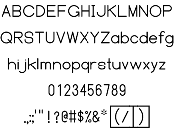
I usually just use Technic or Simplex font. But according to ANSI/ASME standard, the default font type is ASME Y14.5M.
Below is the font type. It looks very neat and very legible to me.

image: http://www.fontspace.com
If you want to download this font, you can download it on FontSpace here. It’s licensed as public domain and commercial use is allowed.
What’s your standard font height and type?
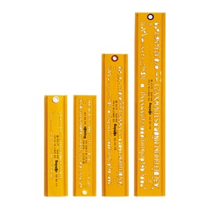
I’ve never used ASME Y14.5M font, and I usually use 2.5mm as my text height. Not by my choice, but it was my company standard. We use Technic. And we also use Architxt for our fancy texts. I think 1/8″ standard was to make it easy using lettering guides.

image: http://www.eckersleys.com.au
But when working with CAD, it’s easy to create smaller letters than 1/8″. The problem is it still must be legible.
I believe many of you also use different standards. What is your standard?


Hello,
I use Arrial Narrow is really good, simple and clear, But I saw test the Y14.5M and was better than Arrial. Although there is a problem, I’m from Brazil and we have accentuation such as “técnico”, “operação” and those letters “é, ç, ã” doesn’t work with Y14.5M Style.
I downloaded many time but still not working. Any change to helpe me?
Cheers
We use ROMANS.shx, at 2.0mm for proposed text and 1.5mm to show existing.
I guess that used to be 80 and 60 on the old Leory text template size.
yes, since Arial has been the OOB default font in Revit (our company standard), and since Revit has become the AEC industry standard, we are also seeing most of our clients in the US aligning to Arial as their standard, or at least acceptable in deliverables.
Prior to CAD, our hand lettering standard was 1/8″ text height to remain legible for half-size sets. After CAD was introduced, since the computer-generated, plotted output provided more clarity, we reduced our text height standard to 3/32″ to gain more real-estate in our drawings, which reduced sheet count in the sets, thereby passing more savings to our clients.
Our AutoCAD Standard was 3/32″ text height, Romans.shx font, using 0.8 width factor, which was also adopted by some of our clients.
Once we standardized on Revit, we changed our AutoCAD standard from Romans to Arial. Specifically, Arial Narrow, 1.0 width factor. Tip: The narrow version of Arial saved space while maintaining clarity and the 1.0 width factor was important, as we found text in Revit schedules would ignore a 0.8 width factor and display as 1.0.
Thank you for sharing your experience, Kevin!
Is Arial font used as a common standard now? I’m not familiar with the standard in US nor Europe, but I do see many drawings use Arial now.