Earlier, we discussed how you can install additional fonts to AutoCAD.
Another common question about AutoCAD fonts or drawing lettering are: what’s the default font type and what’s the font height? There are many standards (and many also said there is no standard) that you can use.

The bottom line is the text must be legible. Not too small and not too big so it will not interfere other objects.
Let’s see the common practice for engineering drawing lettering.
Standard Font Height
Height – 1/8″ is common (1/4″ for titles etc.)
Upper & Lower Case – Engineering lettering is commonly upper case CAPITALS
source: http://www.personal.kent.edu/~rbavis/lettering.htm
1/8″ is common text height (equal to 3mm in metric) and 1/4″ is used for titles. You can find this height is consistent in many resources.
Remember, this is the text height on paper. If you work with AutoCAD, you need to set the correct height for your plot scale. Or use AutoCAD annotation scaling.
Standard Font Type
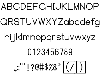
I usually just use Technic or Simplex font. But according to ANSI/ASME standard, the default font type is ASME Y14.5M.
Below is the font type. It looks very neat and very legible to me.

image: http://www.fontspace.com
If you want to download this font, you can download it on FontSpace here. It’s licensed as public domain and commercial use is allowed.
What’s your standard font height and type?
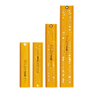
I’ve never used ASME Y14.5M font, and I usually use 2.5mm as my text height. Not by my choice, but it was my company standard. We use Technic. And we also use Architxt for our fancy texts. I think 1/8″ standard was to make it easy using lettering guides.

image: http://www.eckersleys.com.au
But when working with CAD, it’s easy to create smaller letters than 1/8″. The problem is it still must be legible.
I believe many of you also use different standards. What is your standard?


There is an international standard. The sizes of paper start at one square metre (A0), fold that in half you get A1, half again, A2, half again is A3 and half that is A4 – used for letters, notepads etc. Envelopes, shelves, binders, files etc are related to that. In engineering drawings, the font height is related to the stroke thickness as well as the paper size. This produces 2.5mm high letters with a stroke thickness of 0.25mm (the pen nib size) – this doubles up to 3.5mm/0.35 pen – which doubles up to 5mm letters using a 0.5mm pen – then 7mm/0.7mm. This makes life simple – an A0 sheet with a 5mm letter can be reduced 50% to A1 where the letters will appear 3.5mm, and so on. In perfect proportion. Now, to the font. back in the drawing board pen and pencil/ stencil days the international standard was for an IS font with an open 6 and 9, open 4, serif’d one, and barred seven. This was for legibility when reduced to microfilm, or badly reproduced by being fax’d or photocopied several times. These days this is known as ISOCPEUR in AutoCAD true type fonts. Never again does a blurry 6 look like an 8 or 9… before this font became available (Autodesk being an American company), Europeans/ Brits had to fudge things to get as close to ISOCPEUR as possible – this was settled more or less with Romantic Simplex (romans.shx) at a width factor of between 0.65 and 0.8. It was terrible, but the best we could do. Nowadays it is not necessary to use romans, romant etc., when the official font is available. Having said that, Arial seems to be the default for Revit – and while this used to crash pen plotters, and cause screen flickering when zoomed in (due to the font’s sharp edges), it’s no bother these days – it just uses a lot of ink and is a bit on the thick side when drawings are busy. I work in building services, and – like old fashioned maps do – it is useful to mix fonts to distinguish between the architect’s room names (Arial) and the services annotations (ISOCPEUR); different fonts help the readability of a busy drawing.
Hi Edwin,
the German standard is different, maybe also in the EU.
We use following height (every height in mm):
0.18; 0.25; 0.35; 0.50; 0.70; 1.00
The linewidth is 1/10 of the heights.
Cheers Jürgen
I’m made a mistake.
I mean
1.80 mm,
2.50 mm,
3.50 mm,
5.00 mm,
7.00 mm
Sorry for that.
Thank you Jürgen,
Good to know about different standards from Europe!
Edwin, text heights are the Pandora’s Box of CADD standards. We decided to set our text heights up so if you plot an ISO A3/ANSI B sheet at double size (ISO A1/ANSI D) and the same in reverse. It works for most cases and accommodates clients who ask for the other sized sheet after you have finished the drafting modeling.
Beyond developing a Global CADD Standard, the Australian Standards are constantly referred to as the go to standard for drafting in Australia; however it was written for drafting on the board, to accommodate the quality of handwriting and or the stencils (yes I am old enough to have useded those are Cad).
Cheers
Paul
In the comment to ASME Y14.5M., this was created in the mind set of drawings being created for use domestically and internationally. What I am saying is when a drawing is created my anyone if ASME Y14.5M is used then understanding any general notes specific notes will not be misunderstood. This is very important when doing tolerance dimensioning especially in the aeronautical and automotive manufacturing industry.
I have done many drawings both in Imperial and SI units. When using this standard it is very easy to convert drawings back and fourth by just changing templates.
I enjoyed your post.
Thank you for sharing Pete.
I know in certain industry the standards are very strict. In my industry, especially in my country, we don’t really care about that.
It’s good to see you share your expertise here.
BS 8888 doesn’t recommend a font, it only shows what the letters should look like, it’s left up to the CAD vendors to create a font to match!
The standard is based on hand lettering, so it’s kind of irrelevant in the computer age. I think that it’s ok these days to choose the same font as your company uses for letters and so on.
Awesome. Thank you Josh and Paul!
I also think different font types is acceptable (I never use ASME Y14.5M font before!)
As long as they are easy to read when it’s plotted!
Great article!
We use RomanS font printed at 1/8″ for regular text. You can see all our annotation in Section 7 here: http://www.seattle.gov/util/groups/public/@spu/@engineering/documents/webcontent/spu01_006359.pdf
I always like seeing what others do. Great way to improve our standards.
Hi Edo,
I work for a Civil Engineering firm and we have gotten into the habit of using 1/8" (.125") simplex font for Proposed features and 1/10" (.1") with a lighter weight for existing features. This helps highlight proposed work and gives us that little bit of extra space for notes.
I've worked in 7 architecture firms in 4 states (NJ, TX, NE, OR) and all but one used 3/32". The other one used 1/16" which was too tight and didn't allow you to do half-sized prints for checking, etc. Fonts are different in all the firms…
1/8" is not just a common standard, it is also just the correct size for reproduction. Meaning, not everyone generates a pdf and re-prints on a 1200×1200 full size plotter. Some companies still scan drawings (300dpi or smaller) and store in a Doc Management system for viewing or printing. Not all printers can plot 36", or are laser; not all monitors are large and connected to a nice CAD graphics card. Where I work, we developed our standards in the early 80's with small plotter dpi and small monitors and 1 full size company plotter and micro filming. We tested different sizes, but 1/8" worked the best.
Thank you for sharing this Paul.
I use metric, and not familiar with imperial unit. I learned to use 3 mm in college, which is almost equal to 1/8".
But I use 2.5mm when I start to work. It's acceptable even when we worked with old computer with AutoCAD R14.
Thanks for the tip sir… maybe you can add tutorials or standards in line weights
I have some difficulties in line weights for drawing to have presentable drawing
thank you
Hi John, read Paul Munford's article here: http://cadsetterout.com/drawing-standards/line-we…